

The original FindAnHerb app had an identity crisis

THE PROBLEM
The FindAnHerb developers originally wanted to create a resource that helps people in need find relief, but they built the app without a UX designer. Because the foundation wasn’t grounded in user data, the app wasn’t trying to solve any specific user problem and ultimately tried to be too many things at once. Is it a store? A symptom checker? A remedies app? It was hard to tell, and based on the relatively small amount of downloads, it didn’t really resonate with users. The FindAnHerb stakeholders hired me to find ways to improve the functionality of the app and give it a fresh facelift.
THE SOLUTION
Identified who uses medicinal herbs, what context do they interact with them, and which features would be most beneficial
Built a revolving door type of information architecture based around 3 fundamental sections users wanted most; herbs, remedies, and symptoms
Swapped giant walls of text information for an easily navigatable UI that made it possible to include even more information users wanted than the previous version
Overview
CLIENT FindAnHerb
ROLE UX Designer
REQUIREMENTS End to end app re-design
TIMELINE Approx 120 hrs over 6 weeks
-

Understand
Market research
Survey
Personas
Empathy Map -

Explore
Sitemap
Information architecture
Low-fidelity wireframes
High-fidelity wireframes -

Materialize
High-fidelity prototype
Maze.co task test
One-on-one usability testing
Iterations

Who uses herbal remedies and what resources do they use right now?
Most of the competition isn’t very useful, so FindAnHerb has an opportunity to stand above the rest
I took to the GooglePlay store and downloaded every relevant app I could find. I narrowed my focus to the top five options with the most downloads, the most unique features, or the most interesting UI and conducted an in-depth competitive analysis. While each app had its own strengths and weaknesses, the competitor with the most features similar to the goals of FindAnHerb was Herbs Encyclopedia. It is currently rated 4.4 stars with over 100k downloads, which makes it one of the most popular and well-reviewed herbal apps on the GooglePlay store. However, there is an opportunity for FindAnHerb to create an even better user experience by narrowing down what features are most useful to their potential customers.

The average user is an American woman in her 30s-50s who uses both traditional pharmaceuticals and medicinal herbs
I conducted a survey with 30 participants found in Herbalist Facebook and Reddit groups. This survey targeted people who were interested in medicinal herbs but had no other criteria to participate.
90% identify as female*
50% are in their 30s
90% are American
66.7% regularly use medicinal herbs
43.3% prefer to use herbs to manage mild ailments but still use pharmaceuticals for more severe illnesses, and 26.7% use herbs because they believe they are safer than pharmaceuticals
50% just want a remedy when they have a symptom, but nearly 40% look into remedies regularly for interest/enjoyment
*Perhaps American women in their 30s are more likely to participate in a stranger’s survey online, but it doesn’t negate that this demographic is prevalent in the online herbalist circles and would be a target demographic for FindAnHerb.
Users want to incorporate herbs into their daily lives, manage chronic ailments, and usually find their answers via search engine and books
They want remedies for:
• Overall Daily Wellness (70%)
• Pain Management (66.7%)
• Mental Health (60%)
• Sleep Problems (53.3%)
• Common Cold/Flu (53.3%)
• Skin Problems (50%)
• Hormonal Imbalances (40%)
They find remedies from:
• Search Engine (66.7%)
• Books (50%)
• An Herbalist (36.7%)
• A Specific Website (30%)
• Online Forum (26.7%)
• Youtube (26.7)
• App (6.7%)
The features they most want:
• A way to search for herbal remedies based on symptoms ( 73.3%)
• Information on how to incorporate herbal remedies into everyday life (50%)
• An encyclopedia of medicinal herbs (46.7%)
• Options to buy products with specific herbs (40%)
• A way to save and organize herbal remedies (40%)
• A quick video on how to prepare herbal remedies (36.7%)
• Contact resources to a nearby herbalist (33.3%)
• How to grow medicinal herbs at home (23.3%)
The FindAnHerb Personas
I created 3 personas that encapsulate the user data collected in my survey to help guide my decision making throughout the rest of the project.


How can I make massive amounts of information feel easy and effortless to navigate through?

The current design doesn’t tell you what it is or how to use it, and the UI is stiff and generic
I asked 4 people to download the current FindAnHerb app and give me their 30-second review. None of the people were very impressed because they weren’t sure what the app was supposed to do. All participants said it was a nice idea to have an herbalism app, but they would probably end up uninstalling this app because it was too hard to use.
Users don’t know what is searchable in the search bar. It would be more helpful to include something like “search herbs, remedies, or symptoms” to help guide users to what the app is for.
The section titles come across as a little aggressive because they are capitalized unnecessarily. It feels as if the app is shouting rather than offering relief.
Having the products listed so far up on the page makes it seem like this is an e-commerce app rather than an educational app. Participants were especially put off by the placement of products because it seemed more about sales than information.
Overall the aesthetic comes across as a little stiff and generic. A resource for learning, relief and natural alternatives should feel more friendly, soothing, and organic.
Re-building an information architecture based on 3 fundamentals: herbs, remedies, and symptoms
Looking at the current app’s sitemap, the most apparent misstep with this design is the lack of a clear hierarchy of information. For instance, the symptom checker is the app’s most unique feature, yet is hidden in the pull-out side menu. This feature ended up obsolete in my re-design because users weren’t looking at a herb app to diagnose themselves, they were looking for relief from symptoms they know. The main app functionality came down to three simple fundamentals: herbs, remedies, and symptoms. These three distinct components needed a framework that would present the information in digestible sections while also providing a revolving door between them. If a person needs relief from a sore throat, for example, they want herbs that may help, remedies using those herbs as ingredients, and other relevant symptoms they may be experiencing. No matter what a user is looking for, they need easy access to all three of these areas of information. I created a sitemap and wireframes to make sure I had a fluent understanding and a birds-eye view of how this database would work together.

Designing a user interface with the ease of a search engine and the wisdom of a book
Based on the user survey, 66.7% of people used a search engine and 50% of people used books as their main resources for learning about herbal remedies. My goal? Design a user experience with the ease of a search engine and the wisdom of a book. Looking at the original herb details screen you can see it was essentially just a long wall of endless text. This may work for the minority who wants to read everything in one sitting, but it doesn’t really help the majority who are looking for specific information relevant to their needs. I want the abundance of information to be a joy, not overwhelming! To help guide users to find their answers more easily, I divided the herbs information into four easily digestible tabs: details, uses, studies, and products.
The design implementation of iteration 1 ended up just “fine”. Something about it still seemed too stiff and generic and my eyes still kept glossing over out of boredom. In iteration 2 of the design, I softened the overall feel with some leaf-inspired shapes and flourishes. Now we’re getting somewhere.


I found a surprising insight into users that I wouldn’t have noticed with only one form of testing.
Testing methodologies for the new app design
I first used Maze.co to test the most common functions: searching for an herb, finding a remedy, and retrieving an herb added to the apothecary. Though there is always room for improvement, I received great feedback and the majority of the results indicate high usability.

I then conducted one-on-one usability testing with four participants who provided some very important insights about usability and color. In the end, all participants said they would definitely download this app in the future if it was available.
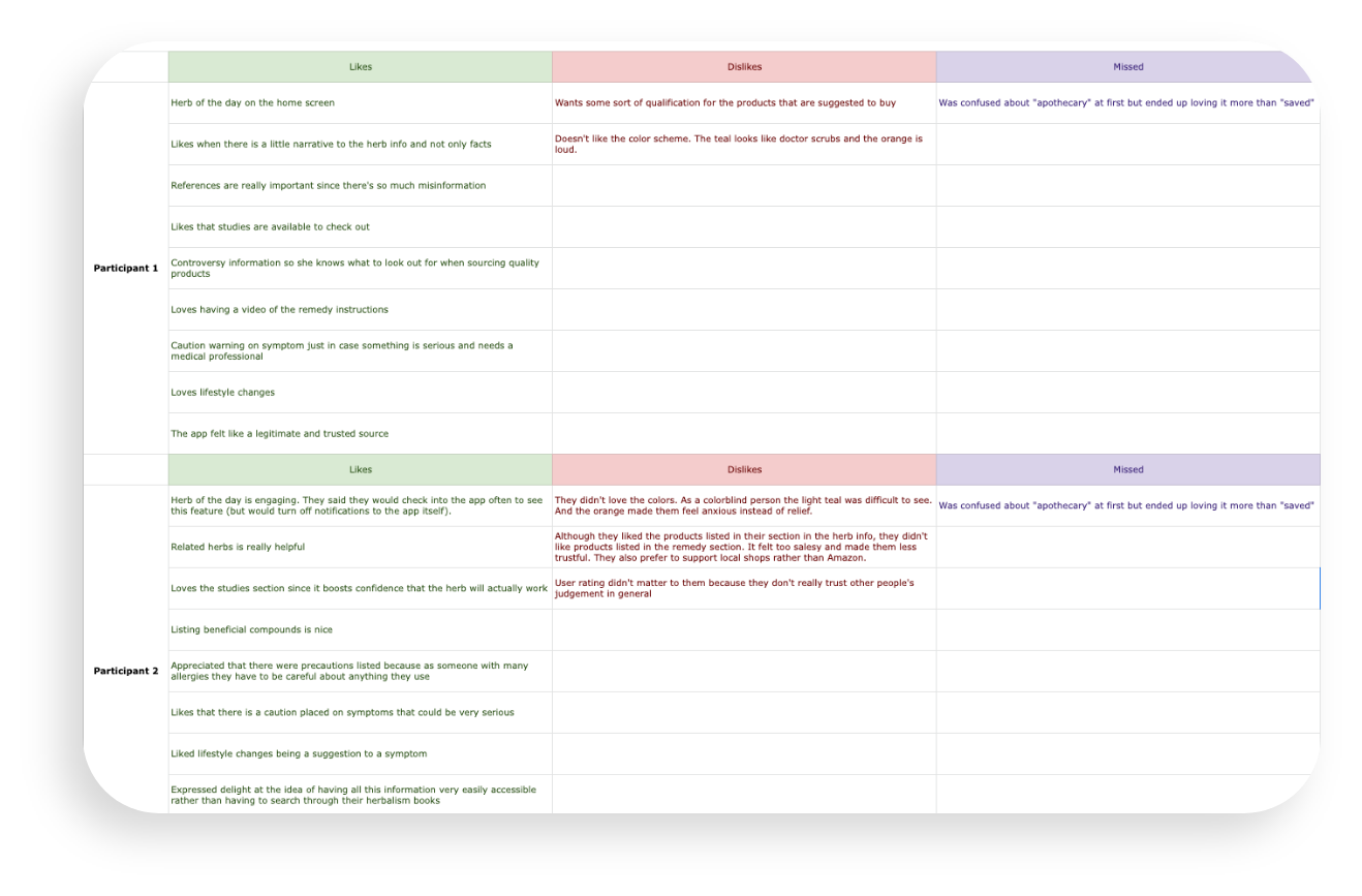

The Apothecary “Problem”
What happens when two different testing methods give you two different answers about a feature?
Using the word “apothecary” in place of “saved” or “favorited” was one of those decisions as a designer that was on the edge of self-indulgence rather than usability. I knew this, felt weird about it, and tested it in my Maze.co test. Not surprisingly 87% of users did not understand that the apothecary was the place their saved items went to. Ok, I’ll change the word apothecary to saved. Easy peasy. Case closed. Or was it?
(plot thickening intensifies)
I conducted my one-on-one interviews after the conclusion of the Maze.co test so I’d have some direction in possible problems to keep an eye out for. As anticipated, most of the participants didn’t understand the apothecary at first either. But when I suggested changing the name to saved for clarity, I was met with passionate opposition. Though the word apothecary confused them at first, the name added a vibe to the app that really resonated with them and they strongly suggested I keep it as is.
The “Fix”

To make it more abundantly clear in my next iteration, I added a message that pops up when you add an item to your apothecary. By using the word “saved” in the context of apothecary will give users the clue they need to understand this feature more quickly.
I find it fascinating that had I only conducted the Maze.co test, I would have immediately changed the word to saved. But by having one-on-one conversations with people I was able to uncover a small detail that they actually really liked once they understood it.

Improving the Color Psychology
The original primary colors were both strongly saturated and competed with one another, so in the new test version, I toned down and expanded the original color pallet. However, in my one-on-one interviews, the colors still didn’t go over well. One participant thought the medium teal looked like doctor scrubs and found that off-putting (try to un-see that now), while another couldn’t see the light teal because he was color blind. Multiple participants mentioned that the color orange made them feel stressed, which wasn’t what they wanted to feel when looking through possible symptoms.
To make the color psychology more pleasing, I warmed up the green to reflect more herbs and less scrubs. I also changed the stress-inducing orange symptoms to relief-promoting purple.
Next Steps
The FindAnHerb stakeholders were thrilled with the new design and I’m currently working with them to put it into development. I will update this case study with more information as the project continues.
