

How do you design a trustworthy experience for something everyone hates doing?

THE PROBLEM
“I just love buying insurance!” said no one ever. Bundl is an insurance company looking to move its brick-and-mortar business into e-commerce for the first time. Unfortunately, most people are skeptical of insurance companies because they have to provide too much information upfront to get a quote. But companies need that information if they want to provide an accurate quote to customers. How do you make customers trust your website enough to provide you with their personal information, and hopefully, their business?
THE SOLUTION
I alleviated the users’ stress and skepticism of searching for a new insurance company with:
Clear, concise copy that provided the cost-saving benefits of Bundl
Helpful CTAs that lead users through a transparent flow through the site so they never got lost or confused at where they were
Friendly, clean branding that helped put the user at ease and make them feel more positively about the company
Overview
CLIENT Conceptual student project at DesignLab
ROLE Product Designer
REQUIREMENTS Logo and branding, responsive web design, copywriting
TIMELINE Approx 100 hrs over 5 weeks
-

Empathize
Market research and competitive analysis
User interviews -

Define
Provisional personas
Persona
Empathy map
Value proposition canvas
Prioritization matrix
Features roadmap -

Ideate
Sketching
Sitemap
User flow
Wireframe
Logo branding
UI Kit -

Prototype
Product requirements
Responsive web design
High-fidelity prototype -

Test
Usability testing
Affinity map
Iterate

It’s not enough to just move a business online.
64% of Americans prefer buying in-store to buying online, all other factors being equal, and it’s estimated that by the year 2040, 95% of purchases will be through eCommerce. Clearly, if businesses want to go to where the people are they need to go online. But an online presence isn’t going to be enough in an industry as competitive as insurance where customers have abundant options to choose from. If the user experience isn’t dialed in, customers are going to move on to a path with less resistance. To set Bundl apart from the noise, it’s paramount I understand what users want, why they want it, and how they prefer to get it.
UX Research Methodologies
Market Research and Competitive Analysis
Insurance is an experience nearly every adult partakes in—usually in multiple forms across health, car, home, travel, or renters—but few may understand how insurance actually works. In diving into my secondary research, I hypothesize that knowing how the insurance sausage is made doesn’t affect the user experience, it’s almost entirely driven by pricing, coverage, and ease of use. Because the insurance industry is profitable through conservative risk assessment, change comes slowly from the big companies like State Farm, Progressive, and Allstate. However, in the last decade, “InsurTech” companies like Lemonade and Root have disrupted the scene by cutting out laborious middlemen and passing on that savings to customers. Whether that is the only future for insurance remains to be seen, but the standard practice for the most competitive companies is to move online and offer salesman-free policy experiences as well as instant customer service when needed. To be a player in the world of insurance, you must have a functional online presence on desktop and mobile.
All the top competitors had these same simple traits on their website landing pages:
Online Quotes
Agent-free experiences
Bundled insurance options
Clear CTA buttons
One-on-One Interviews
Despite a few additional variations such as asking friends and family and calling an insurance company directly, every participant said they always looked online to find insurance quotes and they preferred to use a laptop or desktop to manage their online account over all other options.
All participants said the #1 reason they bought their current insurance policies is because of the cost for the amount of coverage. Despite strong opinions about customer service, bundling, and user interface, every participant gave up their specific preferences in favor of having value for their money.
All participants voiced deep skepticism, annoyance, and disappointment in their experience with buying insurance.
What made them feel positive?
Manage everything online without an agent
Easy and quick quotes
Anything to save money, including bundling policies
A personal touch that made them feel like someone was looking out for them
Knowing they got the best value for their money, not just the cheapest policy
What made them feel negative?
When there are a lot of steps to obtain a quote
Having to put in too much personal information to get a quote
Being oversold coverage for company’s gain
Insurance provider not being on their side
Buying insurance is too hard because of how confusing it is

The problem? People really hate buying insurance.
People feel stupid, scammed, forgotten, and confused when they look for insurance online… but they have to buy it anyway. So how do I design an experience for something people hate doing? By providing the balm that alleviates the pain. If I’m fluent in the user’s frustrations with a product, I’m going to be able to make all my design decisions based on taking those frustrations away.
Provisional Personas


Meet Janet.
Janet is an in-depth version of my provisional “Researcher” persona. Because this highly skeptical perfectionist was the most challenging to please, she became the ultimate critic to make design decisions for. If I can make Janet’s perfect product, chances are most other users would also be covered.
Her perfect product has…
VALUE
Janet doesn’t want just the cheapest insurance policy, she wants the best value for the price.
EASE
She’s a busy woman, and it’s important for Janet to manage her policies online in her own time.
CONFIDENCE
Janet wants insurance that makes her feel like an expert, not an idiot.
TRUST
She wants a personal touch that makes her feel like a person instead of dollar signs.


Designing a product based on value, ease, confidence, and trust.
When ideating it’s easy to only focus on the task a user needs to get done; in this case, find and buy insurance. Simple right? But based on the research so far it’s obvious that this experience is a lot more than that. It needs to be grounded in emotional intelligence that speaks to the underlying psychology of the task that needs doing. People don’t just want to find and buy insurance, they want to find and buy insurance AND feel good while doing it.


To help me create the perfect product for my Janet persona, I made a sitemap, task flow, and user flow to establish a bird’s eye view and suss out any friction points. In particular, I focused on creating flows that would give users options to navigate away from their current path and back to it with ease. This helps relieve both the pain of feeling stupid by not knowing where you are and the propensity for skepticism because you’re locked into something too soon. Users don’t want to feel trapped by any specific option if they’re still browsing and researching, nor do they want to lose the important information that will help them make a decision.
Also included in this gallery are the feature roadmap and prioritization matrix that helped me focus on the MVP rather than getting lost in the ideations.

From sketches to high-fidelity
Much of this design is based on the assumption that users wouldn’t know what insurance bundle to buy, so I funneled them to the quiz to feel more confident. Spoiler alert! This assumption ended up being wrong. Keep scrollin’ to see what happened and how I fixed it.
Building Beautiful UI
All participants in my research expressed stress when talking about insurance, so I created a trustworthy, friendly, and simple aesthetic that would make them feel like they were taking a breath of fresh air.


Making the ideas come alive for testing.
Creating a prototype that feels like a real website is vital for proper testing. If I’m too busy having to explain how something functions because I didn’t prototype it well enough, I’m going to miss out on important insights from my users.


Make sure it looks good
no matter how it’s viewed.
Although all the participants in my one-on-one interviews preferred to look for insurance on a computer rather than a mobile device, they may need to file a claim or check information on the go in the future. If you’re in a stressful situation after an accident, the last thing you want is a broken mobile website when you’re looking for help.

How can I make this even better?
Usability testing is not the finale in which I rest on my confirmation-bias-laurels, congratulating myself for a product well done while turning a blind eye to the things I’ve designed wrong. Rather, testing my prototype is a real-time observation of what the next iteration needs to be. And, admittedly, that’s exactly what excites me about UX design so much.
Usability Testing Methodology
I conducted an in-person observation with seven participants using a laptop and a prototype website. Each participant was told this was a website for an insurance company suggested to them by their friend, but no other context was given. Participants were then encouraged to openly narrate their thought process as they navigated through the prototype. After 10 seconds, participants were asked how they’d describe the homepage and then were free to flow through the task without interruption. As the facilitator of the test, I did not coach navigation or answer questions until the user was finished.
Insights From Testing
SUCCESSES
• Most users found the visual hierarchy clean, and clear.
• Almost all users commented on how friendly the illustrations are
• All users completed the quiz effortlessly
• Many users really enjoyed the comparison matrix
PRIORITY REVISIONS
• Users need to see the clear benefits of bundling without having to read the copy
• Every user missed the product page at first and therefore didn’t quite understand the product.
• Most users wanted to see a price comparison before they felt comfortable moving forward with a quote.
Correcting a Wrong Assumption
I designed task flows based on the assumption that users wouldn’t know what insurance bundle to buy and therefore would mostly rely on the bundle quiz to find the coverage they needed. However, I consistently found that users delighted in seeing all the bundle options because they could visualize better what “lifestyle” they were. Users preferred using the quiz as a last resort rather than the first. While the quiz is still a prominent option, this iteration directs users more towards seeing all the bundle options than taking the quiz.
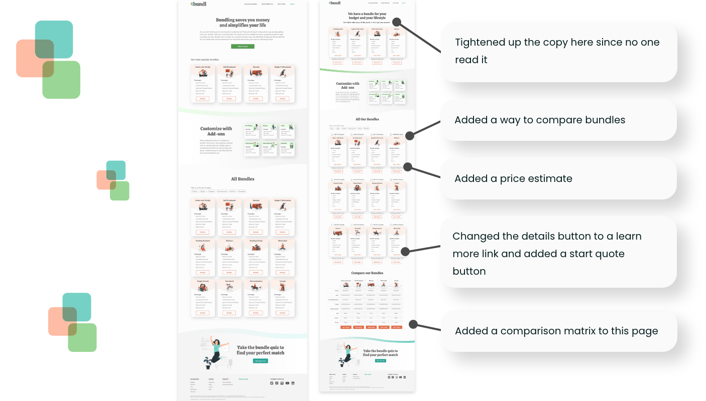
Improvements Made to V2


Conclusion
Even though this was a conceptual project, I learned so much about how to use empathy to build a trustworthy experience even for the most skeptical customer. A good visual designer would be able to make a nice-looking website, but a nice-looking website won’t be enough to disarm people who are heading into an experience ready for a battle. Asking the right questions, listening, and keeping the user in mind every step of the way made this project a success.
