

Is it possible to improve upon Google?
THE PROBLEM
Most podcast apps are notoriously dysfunctional for regular listeners, with no customizable features that make it easier to listen, share, or save podcasts they like. Google Podcasts is no exception. Podcast enthusiasts want more control over how they interact with their shows and have put up with “good enough” for too long.
THE SOLUTION
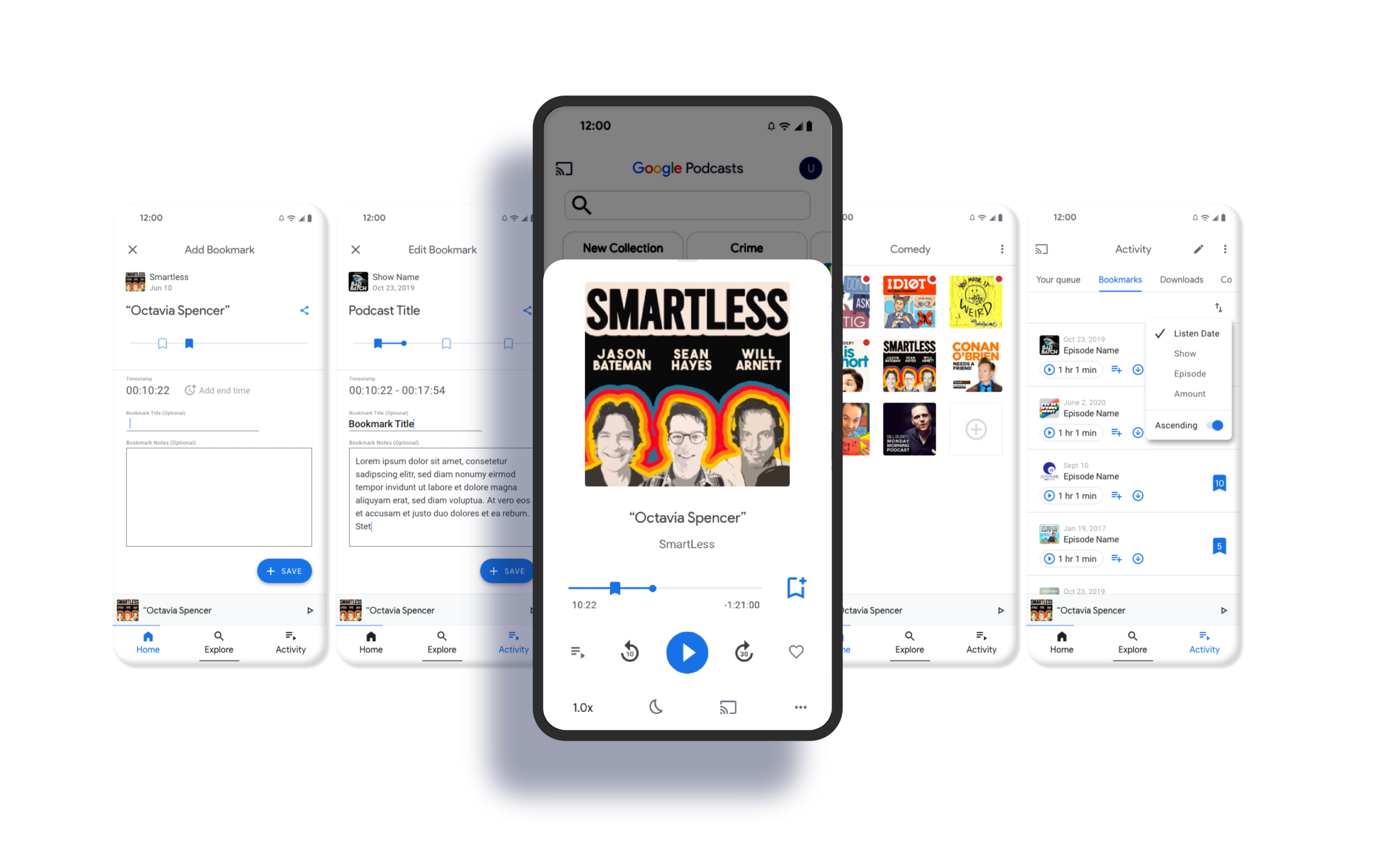
a bookmark feature allowing users to save time-stamped notes within an episode and retrieve or share them later
a collections feature for better show and episode organization
Overview
CLIENT Student project at DesignLab
ROLE UX Designer
REQUIREMENTS Adding a feature to Google Podcasts
TIMELINE Approx 80 hours
-

Empathize
Market research
One-on-one interviews
Survey -

Define
Empathy map
Value proposition canvas
Problem statement brainstorm -

Ideate
Sitemap
Task flows
User flows -

Prototype & Test
High-fidelity prototype
Maze.co user task test
Iterations

Turning “good enough” into really great.
Users shouldn’t always have to settle for a “meh” experience when the answer for improving is just a little UX research away. By understanding users and asking them what experiences they wished they had, I learned exactly how to improve Google Podcasts. This insight is what leads to the innovation that can put one app above another in a highly competitive race.
UX Research Methodologies
Market Research
Podcast popularity is exploding
In June of 2018 there were over 550,000 podcasts available. Just 3 years later in 2021 there are over 2 million totaling 48 million episodes. It is estimated 75% of the US population is familiar with the term “podcasting” and half the population has listened to podcasts—37% of the total population being monthly listeners. And while Google Podcasts continues to grow in popularity, it’s losing out to Spotify and Apple Podcasts. But as I learned in my user research, that’s not because users are particularly loyal to their current app choice, which gives Google the perfect opportunity to win more users over.

Competitive Analysis
The current experience is… *yawn*
None of the main competitors (Spotify, Apple Podcasts, Stitcher, Podcast Addict, Castbox) nor Google Podcasts, had interesting ways to personalize or organize listening beyond extremely basic options like:
• Subscribe or follow shows
• Share show or episode via URL
• Sort show episodes chronologically backward or forwards
• Sleep Timer
• Search for new shows
• Suggested popular shows or suggested by genre

User Research
Most people tolerate “good enough”, but have some opinions…
To gain more insight into podcast listeners’ joys and pains, I conducted one-on-one interviews with 5 avid podcast listeners. Based on the patterns and insights I observed in these interviews, I created a survey with 42 participants to see if the same patterns existed on a wider scale. Nearly all participants voiced annoyances when asked about their current app experience, but most seemed to simply put up with it because there aren’t better options to go to. I believe listening to the needs of the users can help Google Podcasts create a more innovative product that will stand above the competition.


In my one-on-one interviews, I identified 3 possible features that I tested in my survey (and participants could add their own if they wanted). Having better organization of podcasts was the number one most requested feature, followed by timestamped notes, and a better way to create a curated recommendation list for friends/family.

What are the problems to solve and why?
Instead of approaching problems from complex personality/lifestyle points of view (a la traditional personas), I simplified my approach by only focusing only on finding the problems to solve. The persona, if there was one, would simply be anyone who listens to podcasts.


P R O B L E M S T A T E M E N T
As a Google Podcast user, I want better ways to organize and personalize my podcast experience so I can listen to, and share them with others, more easily.

Integrating new solutions into an existing framework.
It didn’t matter if I came up with good solutions if those solutions couldn’t fit perfectly within Google Podcasts. The last thing I want is to solve one probably only to have three more problems pop up because of it.
I took great care in making sure I was fluent in the existing platform so my new features would seamlessly integrate. I made task flows for every common user task and then created a user flow to fully understand the current ways the app functioned.
To address the problem statement, I came up with two solutions to implement into the current app:
Customizable collections so users can sort podcast shows and episodes more easily.
A bookmark feature that will allow users to save timestamped notes on podcast episodes.
I created a sitemap of the current app and brainstormed ways my new features could assimilate into Google Podcasts. I then made lo-fi wireframes of the needed screens in the context of a task flow.

A valuable learning experience about doing it kinda wrong.
I prototyped like I normally would using Adobe XD—which was functional enough for in-person usability testing. However, it was my first time using Maze.co for task testing and while it’s an excellent tool to use, there’s a learning curve with the Adobe XD compatibility I didn’t anticipate. Some errors were my fault, and some errors might have had a different outcome with a fully compatible app, but I still learned a lot about how people would navigate my new features. I also learned a valuable lesson about the art of prototyping: test (a lot) before you test.

Testing, testing, 1… 2… 3…
I had 8-10 participants using Maze.co to test the usability of three different tasks that used my features. Dive into the complete test here.
To the left, you can see an example of the inattentive prototyping that ended up skewing the results.
Task 1: Create a new collection and add a podcast to it

6/10 correctly created a new collection and added a new podcast to it*
80% said they would use this feature if it was available to them
9/10 said they wouldn’t change anything about this feature
80% found it easy or very easy to complete
*Had the XD prototype been better crafted and more seamlessly integrated into Maze, I believe more testers would have correctly completed the mission. There was a glitch unknown to me until the testing was over that made this task more difficult than necessary. This was an excellent learning experience and I will ensure future tests will have less room for error.
Task 2: Create a bookmark for the podcast they’re currently listening to

8/9 correctly created a new bookmark*
100% effortlessly identified the bookmark icon once they viewed the current podcast they were listening to
88% said they would use the bookmark feature if it was available to them
8/9 rated this task as easy or very easy
*The one tester who gave up on this mission wasn’t able to find the podcast they were currently listening to and therefore couldn’t move forward.
Task 3: Retrieve a bookmark made on a previous day

8/8 correctly retrieved a previously created bookmark
88% said they would use the bookmark feature if it was available to them
Most of the suggestions to improve this feature included adding a way to sort the list of bookmarked episodes to find them more easily
Usability Testing Insights
Successes
Users knew how to add a bookmark to the current podcast they were listening to without tapping around.
Over 80% of users reacted favorably to both features and would use them if it were available on their podcast platform.
Most users were able to find “Add a Collection” from the Home Screen.
Failures
The prototype should have been a little better integrated into Maze to prevent errors.
Users had difficulty finding the Bookmarks tab in Activity.
A user wanted more ways to customize playback for their collections, which fits the previous commentary from users about having more customized listening options.
Many users expressed a need to better organize their bookmarks to more easily retrieve and share them at a later date.
Priority Solutions
Ideate on ways to make the bookmark tab less confusing:
What if instead of a bookmarks tab, the bookmarks showed up on the history tab? Either way, bookmarks should show up anywhere they exist.
Make a sorting option for bookmarks (by date, by show).


Conclusion
Even if you’re Google, there’s still always room to improve your user’s experience. Asking, listening, ideating, implementing, and iterating are all worthwhile tools to find ways to delight and impress users.
**Please note, Google Podcasts has since been updated and no longer reflects the aesthetic I used for my base design in this project.
