Just because something’s common doesn’t mean it’s what users want

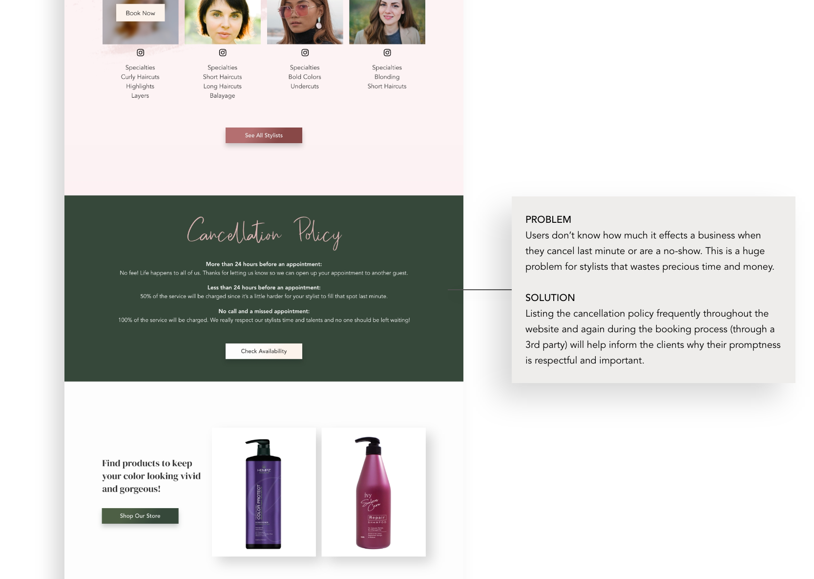
THE PROBLEM
Poise is a new salon needing a strong online presence in a highly competitive market. Although a salon website seems like a simple tried and true website experience that wouldn't need much research or analysis, I found some surprising insights into chronic company/user disconnects. Most salon customers, even those who have been going for decades, are confused by pricing and service jargon. They don’t know how to communicate what they want to the stylist and have left a visit feeling a lot of shame and frustration.
THE SOLUTION
Identified salon customers’ most common pains about miscommunication and unmet expectations
Bridged the customer/stylist disconnect with comprehensive information about styles, services, prices, and stylist specialties
Worked with the stakeholders to come up with a stylish logo and brand that set a welcoming tone online for their refreshing experience in person
Overview
CLIENT Poise Salon
ROLE Product Designer
REQUIREMENTS Logo and branding, responsive web design
TIMELINE Approx 100 hrs over 5 weeks
-

Empathize
Competitive analysis
User research
One-on-one interviews -

Define
Personas
Empathy map
Value proposition canvas -

Ideate
Sitemap
User flow
Sketching
Wireframe
Logo branding
UI Kit -

Prototype
Responsive web design
High-fidelity prototype -

Test
Usability testing
Affinity map
Iterate

A little research goes a long way.
Salon owners have a literal hands-on experience with their customers, but like many businesses who know their clients on a personal level, they might be missing crucial user experience information because they’ve forgotten what it’s like to be a first-time customer. Confirmation bias is a tricky siren when you only hear feedback from returning clientele rather than the lost potential customer you didn’t see skip over your website. It would have been easy to assume and move forward, but by conducting a little UX research I was able to uncover a significant disconnect with the current industry and what people actually want.
UX Research Methodologies
Competitive Analysis
Analyzing websites of 6 direct competitors (local area) and 4 secondary competitors (high-end metropolitan areas like LA and New York) and forming a comparison matrix of the main features. Highlighted in red are the most important features to customers—notice how few salons include a description of their services. This is a huge problem when positioned against my user data… and a huge opportunity for Poise to capitalize on.

User Review Research
The most common reasons for 1-star reviews across hundreds of Google reviews:
The customer spent more than expected, particularly when they felt misled by the prices listed on the website
The stylist didn’t have a caring or welcoming demeanor or made the customer feel rushed
The style didn’t turn out as expected, especially if the customer felt like they clearly explained what they wanted
One-on-One Interviews
User Big Issues
Wanting to feel listened to, taken care of, and welcome
Feeling like their hair was very specific, hard, or unruly so it was important to see examples of specific hairstyles they are looking for or feel reassured a stylist has the right skills for their vision
Price needed to match the value—most users were OK paying more for an elevated experience but were incredibly disappointed if they paid more than they were expecting or didn’t get a good service
User Non-Issues
Salons/websites having a specific or modern style—it just needed to be clean, comfortable, and reasonably updated
Having perfect reviews wasn’t important to participants because word of mouth had a bigger impact
I N S I G H T S
People can carry a lot of pain and frustration in their salon experience.
Most competitors are not doing anything to alleviate that pain and frustration.
What Users Want
• Prices are listed online and set a realistic financial expectation
• It is easy to find photo inspiration of the style they’re looking for
• Stylist bios outline their specialties/skills/strengths
• To feel educated, empowered, and special
What They Were Getting
• Prices and services were misleading, confusing, or didn’t properly educate the user
• Lack of a recent hair portfolio or links to a robust Instagram presence
• Stylists bios didn’t always include skills
• Shame, frustration, intimidation

Give customers a voice.
Hair salons are a multi-billion dollar industry serving millions of customers per year. To help guide my design decisions that will lift Poise above the widespread industry shortfalls, I created three personas based on my interviews which encapsulate the majority of customers’ needs. I then defined exactly the types of features the Poise website needed to fulfill those needs.


Implementing the research in a high-impact way
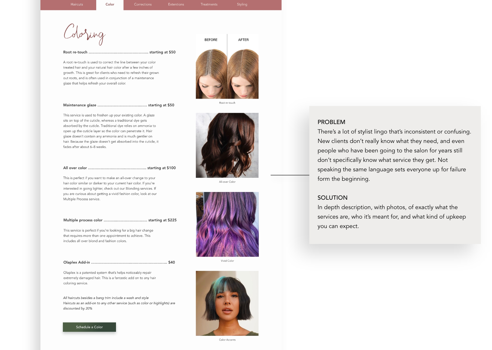
Set the right expectation from the start
Most people understand salon pricing varies based on hair, but having an accurate ballpark and estimate is vital for users. No one wants to leave the salon paying hundreds of dollars more than expected with a style they didn’t ask for. To solve this disconnect, Poise’s website needs ample example imagery and exceptionally clear information about services and pricing.
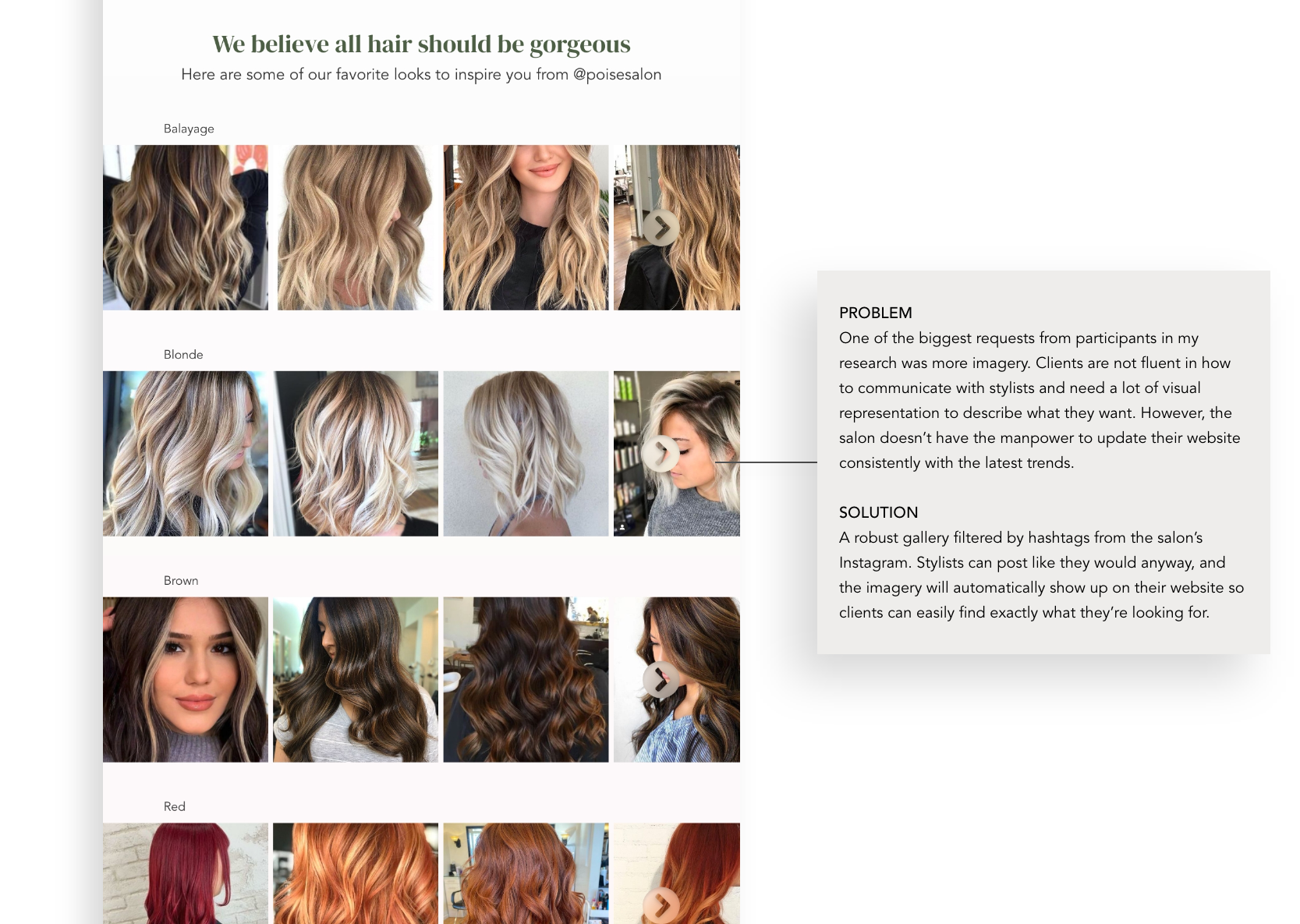
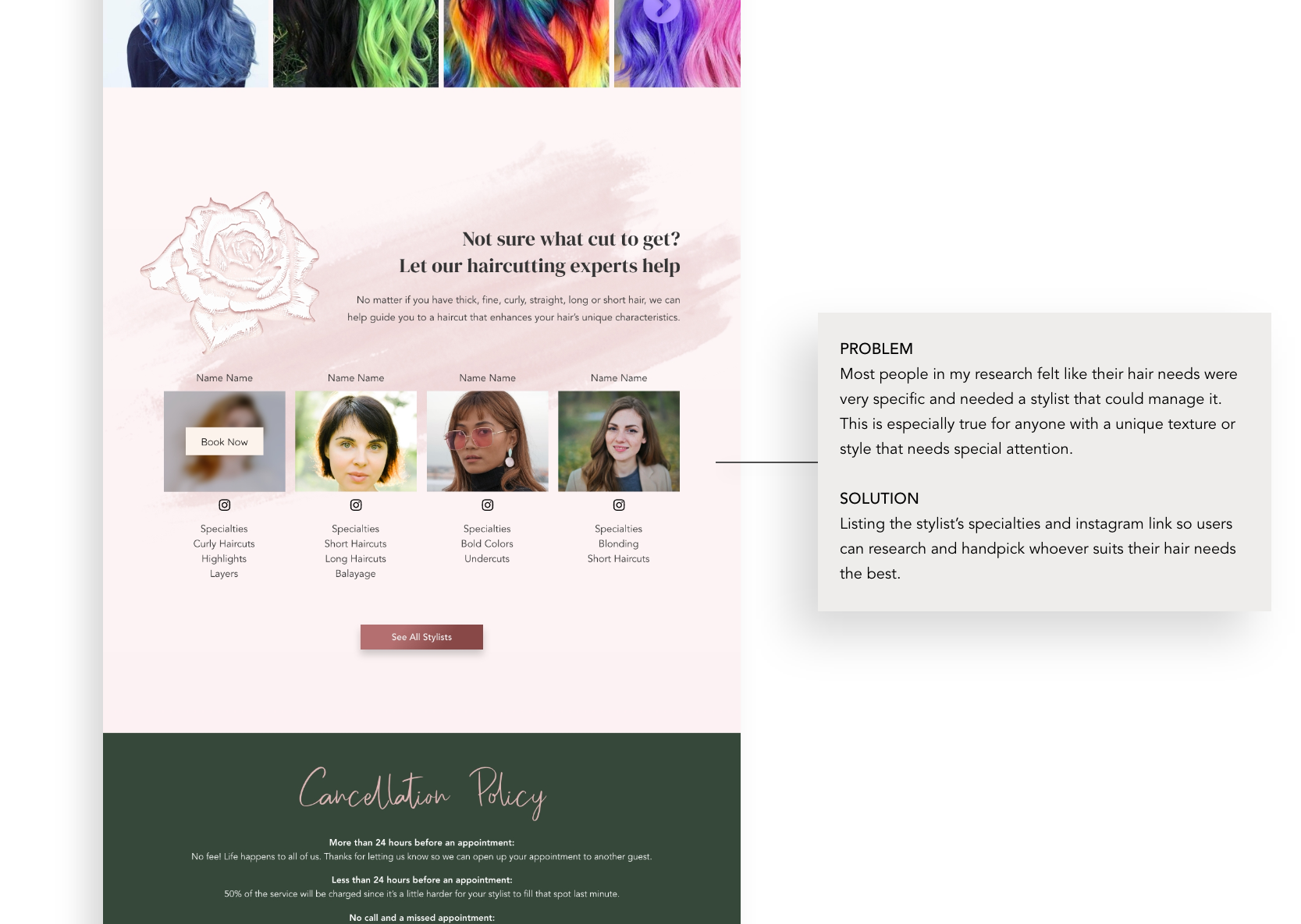
Show off stylist’s skills and specialties
Customers want to see stylist bios on the website to find out who could do the specific style/technique they were looking for. There should be clear labeling of what a stylist can do, and a link (or an auto-populated gallery) to their Instagram account to show off their skills.
Put them at ease and make them feel special
It’s way too common for people to have negative experiences with salons that left them feeling frustrated, uncomfortable, ashamed, or ugly. Setting a comfortable, inclusive, and informative tone on the website that can carry over into the physical space will really set Poise apart.
Simple booking options
People have preferences. Make it easy on them. That means options for booking online, over the phone, or via text message. Bonus points if there is a calendar of availability!

Distilling “feeling comfortable in your own skin” into a brand.
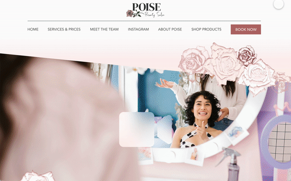
The stakeholders chose the name “Poise” because it means elegant and balanced, and that’s exactly how they want all their clients to feel. Although they’re a high-end salon, they want every person who walks in their doors to feel comfortable and beautiful in their own skin. This was not going to be a basic beauty brand that preys on insecurities, but rather a down-to-earth confidence-boosting oasis where everyone is welcome and wanted. Buckle up because the next section is full of non-linear ideating iteration goodness.

To find exactly the right mood for my stakeholders I studied their chaotic compilations of Pinterest board inspirations and found the through-line. A feminine, friendly oasis that wasn't so high fashion as to intimidate customers but was trendy enough to be Insta-worthy. After a few tweaks from the stakeholders, we were on our way to building the Poise brand.

During the days the mood board was being perfected, I put together some higher-fidelity ideations of what the homepage layout could look like. The stakeholders liked elements from each and wanted me to incorporate them into the layout of the 3rd option.

After a couple of little iterations (like adding a video), the stakeholder's final decision before I did a complete wireframe was what version of roses they wanted to adorn the website with. Turns out they have good taste (it was my favorite one). Now that the mood and brand are becoming more realized, it's time to suss out the rest of the website.

When wire-framing the layout, especially the service information, I made sure to ground each page in function before form. I wanted the aesthetic to enhance the UX, not stand in its way.
Problem-solving the
client to stylist disconnect
The sitemap ended up being pretty simple, but the page layout and content were what would really make or break the user experience. See how I addressed the user (and stylist) problems below.

An inspiration that became a logo
The logo started with a rose graphic the stakeholder found on the internet years ago, and she knew she wanted it to be the main inspiration for her brand. The rose on the right is the final iteration of my interpretation of her graphic. I created it with the help of a purchased graphic pack of hand-drawn rose elements and Illustrator.


Many iterations later…

The final logos, all slightly different for different uses, complement each other and become the maestro to conduct the rest of the Poise branding.


UI Kit


Bringing it all to life.
The real copy and imagery weren’t available for the test, so I was careful to make the rest of the design feel as real as possible to gain helpful feedback during testing.

A responsive experience no matter where you are
In my initial research, I learned that users looked for a salon on many devices, so I made sure the Poise experience would be pixel perfect on every size of screen.


So is it compelling enough to book?
I conducted an in-person observation with 4 participants using a laptop and a prototype website. Participants were encouraged to openly narrate their thought process as they navigated the prototype. As the facilitator of the test, I did not coach navigation or answer questions until the user was finished. The users of this test were different from the original one-on-one interviews.
P R A I S E S F R O M T H E P A R T I C I P A N T S
“It looks very intentional like they know what they’re doing.”
— Participant 1
“I’d definitely book here because it explained the services and pricing better than anywhere else.”
— Participant 3
“The color scheme is very on point and the fonts are perfect!”
— Participant 2
“Oh cute! Super cute! Lots of vibe! I love that it looks professional and feminine.”
— Participant 4
Correcting the Clunk
Although participants in the usability test were overwhelmingly positive in their feedback—with all of them expressing direct interest in booking with Poise—there were a couple of spots of clunky UI navigation that needed to be improved.


Next steps
I handed off all the designs to the web developer and I’m excited to see the final result with the real photos and copy! I’ll update this case study once the website is finished and the salon is open.